SKF - Svenska Kullagerfabriken
Building scalable design system for 250+ digital touchpoints

Largest re-brand ever
Context
SKF is undergoing its largest rebrand in ever. A transformation for over 250 digital touchpoints across web, mobile, and applications. This need a future-proof design system: responsive, accessible, and tokenised. The challenge is not just creating components and a bullet proof token setup, but also establishing a shared foundation for designers and developers across global teams.
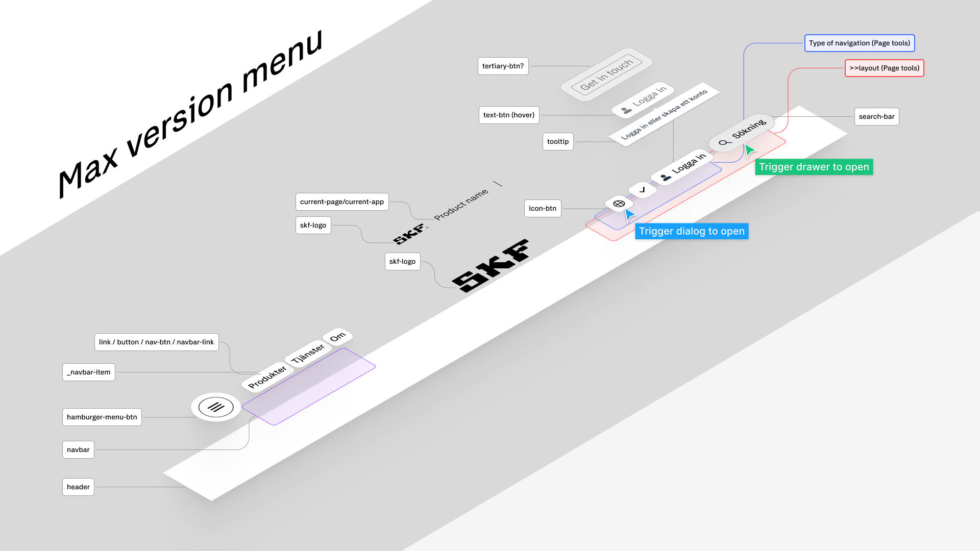


We adopted an atomic design methodology, starting from the smallest building blocks (atoms, molecules) and scaling up to larger components.
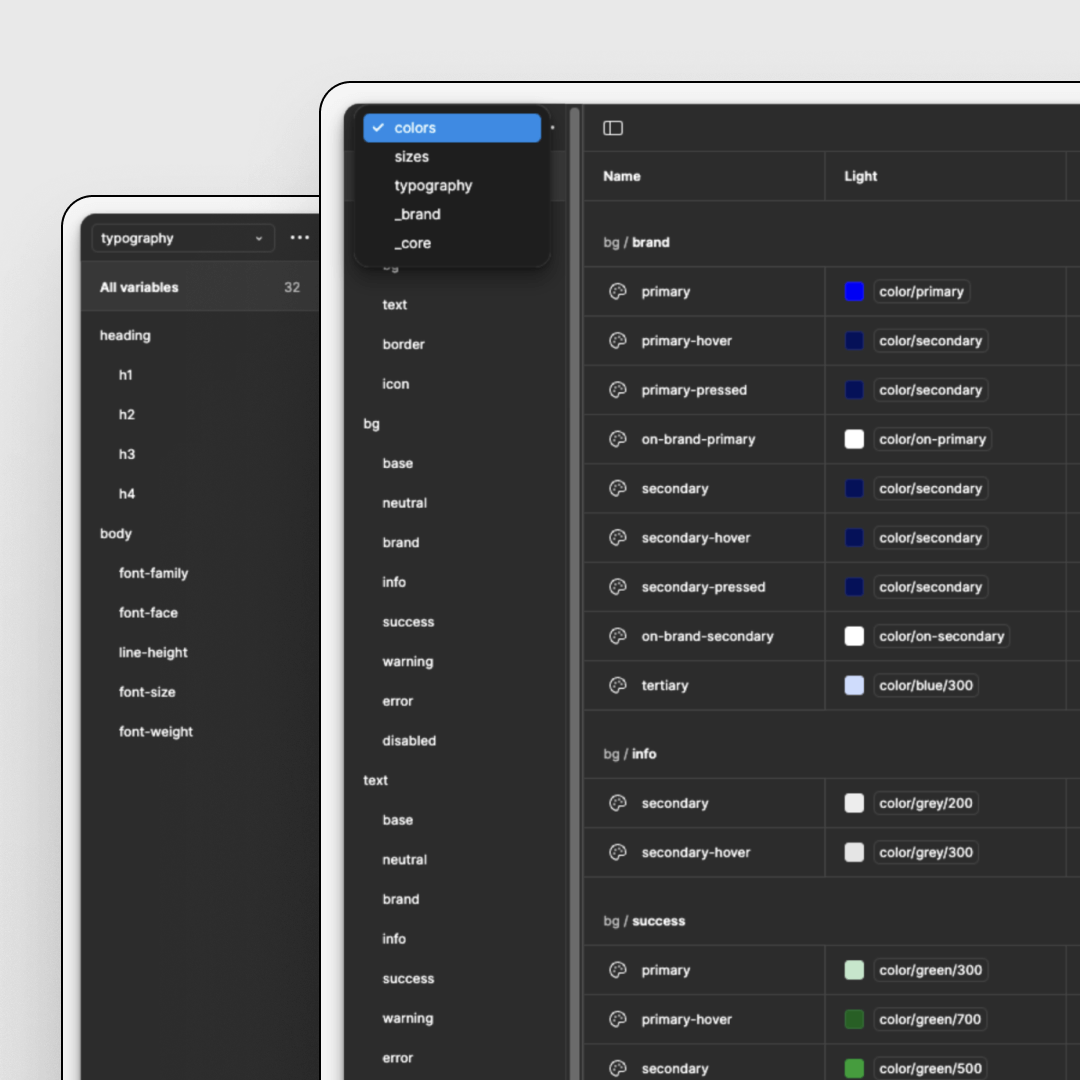
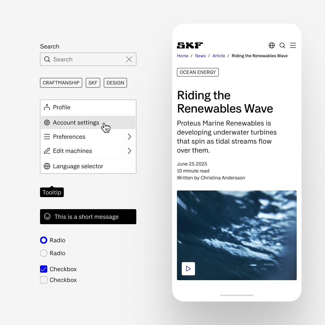
Atoms & Molecules: Buttons, inputs, toggles, typography, color tokens, spacing system.
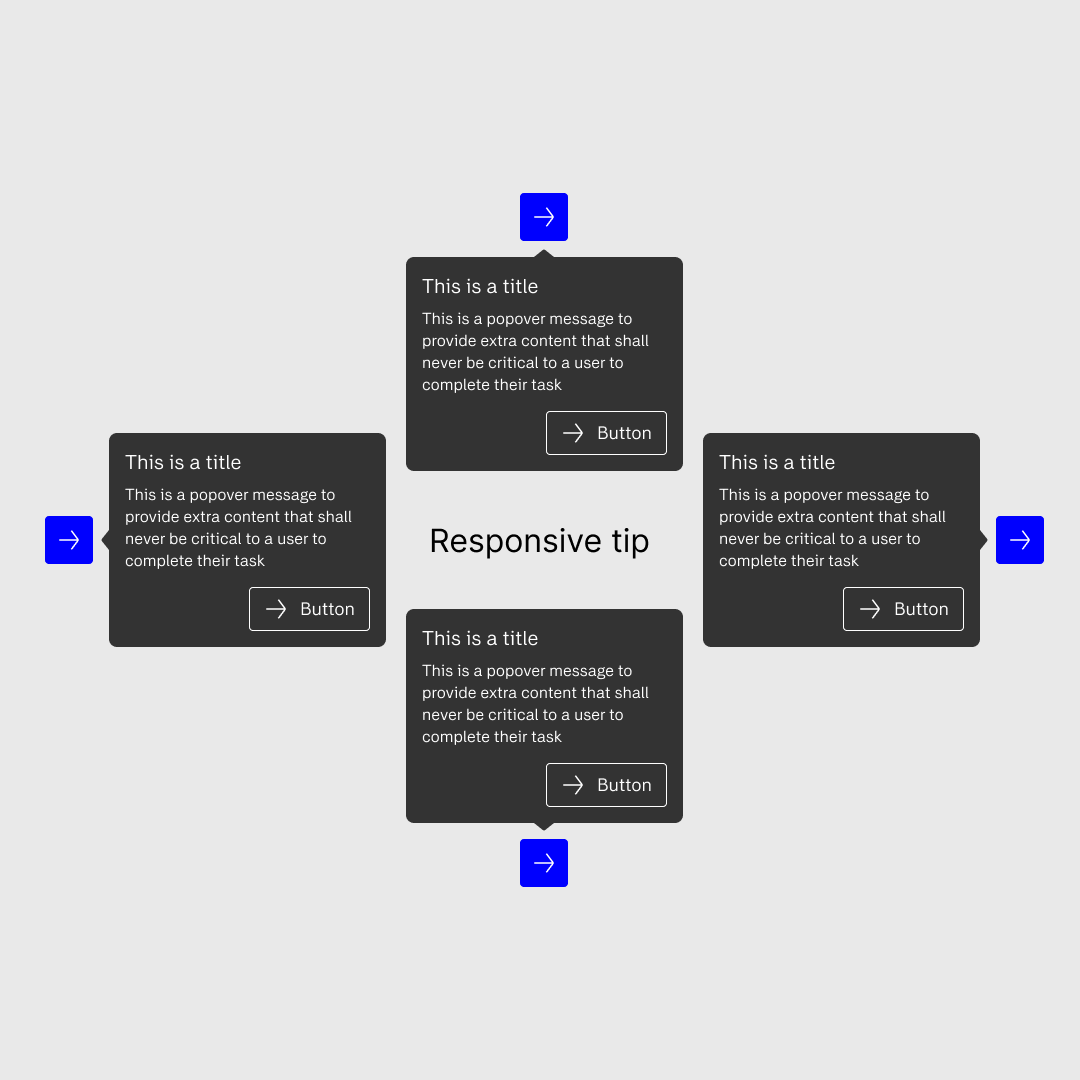
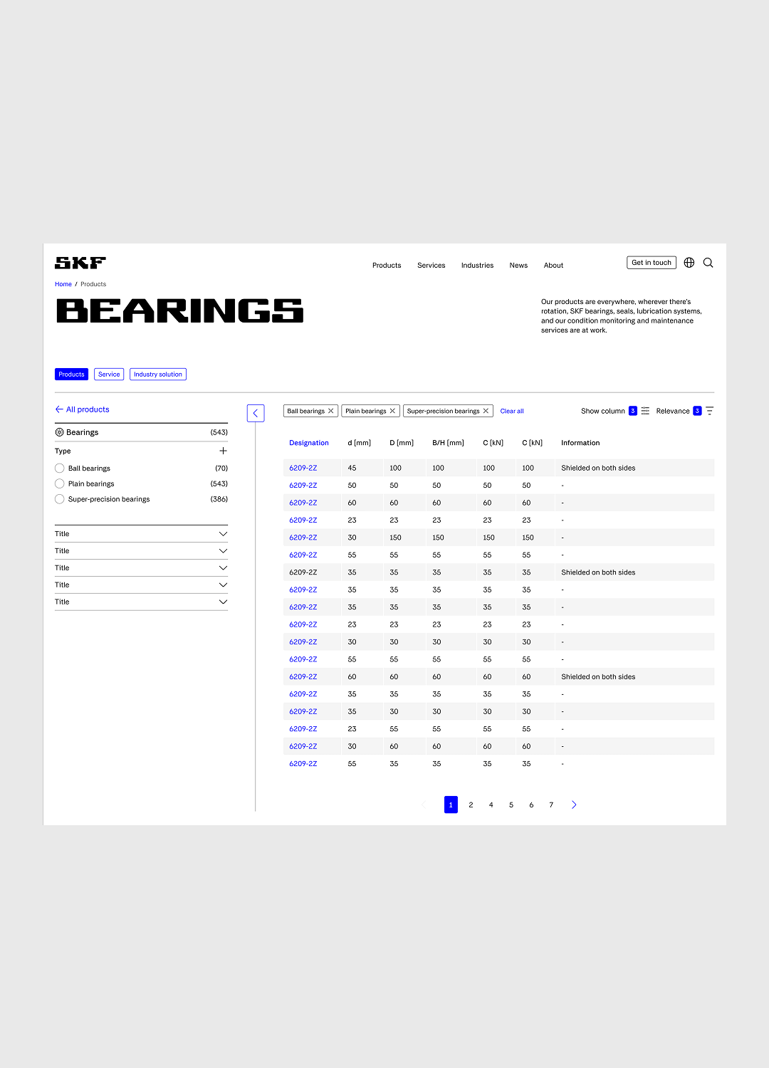
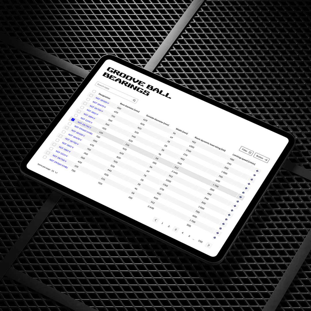
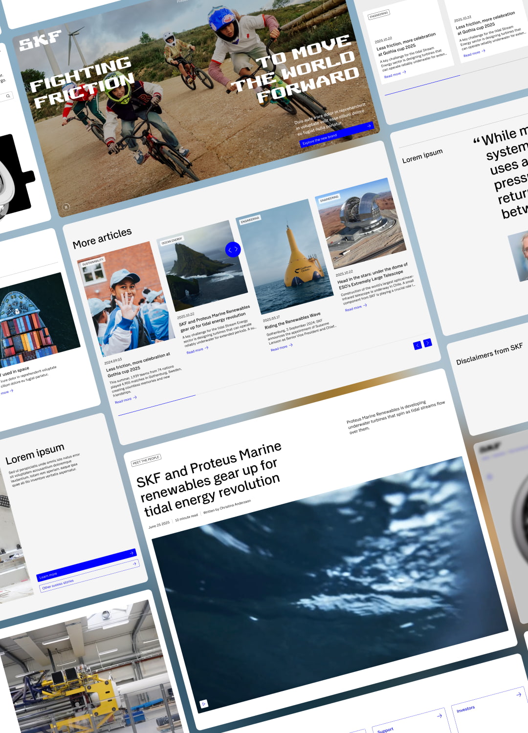
Components & Patterns: Navigation, forms, tables, modals, and more.
Tokens & Modes: Full support for light and dark modes, with flexibility for future brand extensions.
Accessibility: Deep compliance with
WCAG 2.1 AA, including aria-labels, focus states, and contrast ratios.
Our process was highly iterative and collaborative, split in two-week sprints, each focusing on one component. Every detail, from Figma limitations to developer handoff issues, was examined and resolved.
Atoms & Molecules: Buttons, inputs, toggles, typography, color tokens, spacing system.
Components & Patterns: Navigation, forms, tables, modals, and more.
Tokens & Modes: Full support for light and dark modes, with flexibility for future brand extensions.
Accessibility: Deep compliance with
WCAG 2.1 AA, including aria-labels, focus states, and contrast ratios.
Our process was highly iterative and collaborative, split in two-week sprints, each focusing on one component. Every detail, from Figma limitations to developer handoff issues, was examined and resolved.