Vattenfall
How to build scalable design systems for multiple markets
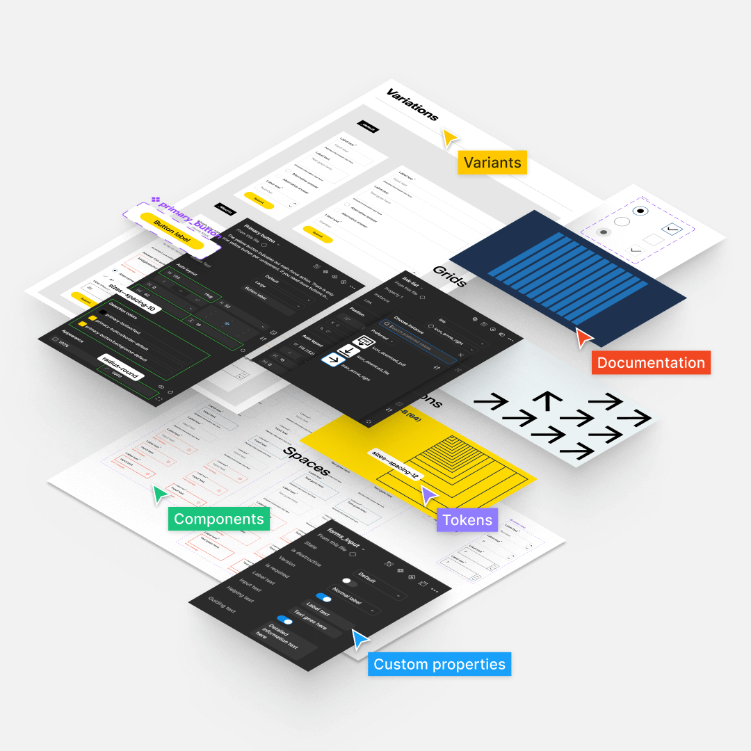
Tokenisation to minimize guesswork
Introduction
A history with a bunch of Figma UI kits, but found they lacked in size, flexibility, or quality – often all three – which led to the beginning of this project. Building one source of truth for the Vattenfall brand, with robust built components. That’s where I come in. I have searched and sourced through old UI Kits, documentation and guidelines to locate all web-components that are built within Vattenfall.
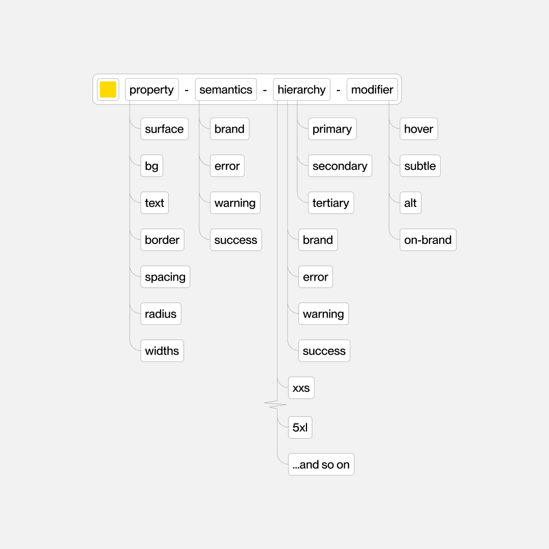
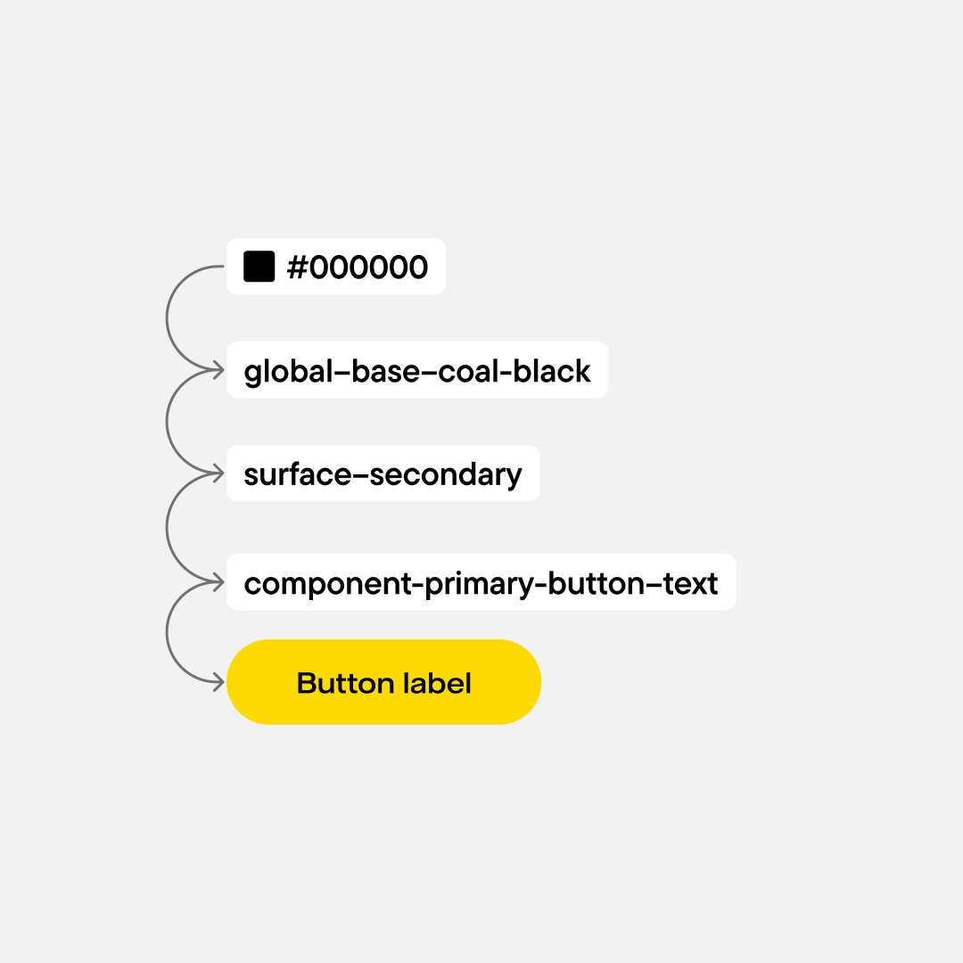
“Design tokens is a method for managing design properties and values across a design system”
This story begins with an audit of documentation, brand guidelines, web-component libray and many many Figma files. The audit helped lay the ground for the project of creating a robust design system that would serve as a single, reliable source of truth. Understanding the inconsistencies, the issues they bring and also the opportunities to consolidate some of Vattenfall’s markets different needs.
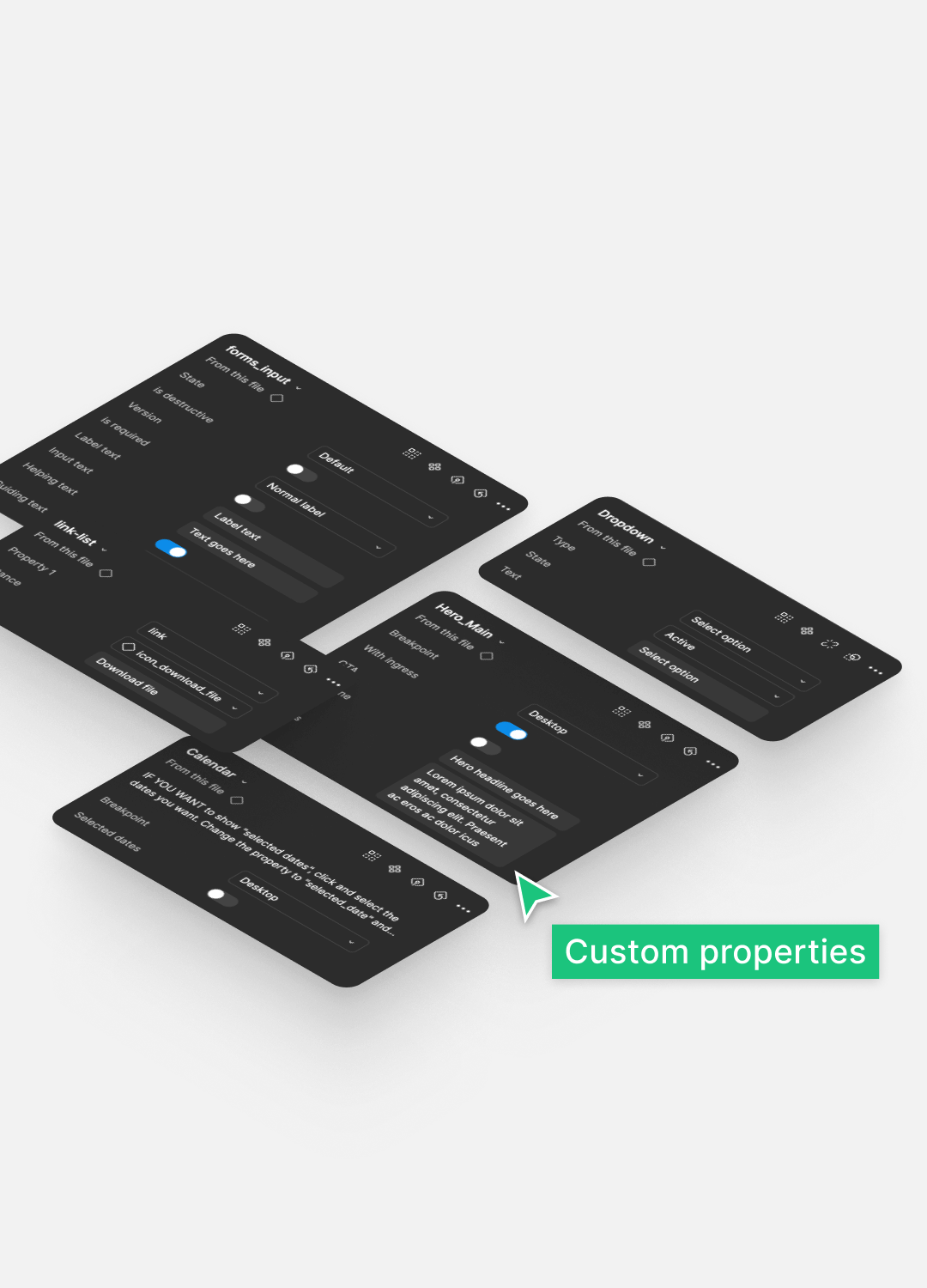
I began with stripping away redundant components and unnecessary designs. Scoping a great set of “first delivery” components. Together with tokens. Design tokens is a wonderful method to manage design properties and values across designs using the library.
A design system of this scale ( first-delivery) is not expected to solve even half of the different teams needs within Vattenfall. But more importantly in my opinion, a design system of this scale best feature is it’s tokens. When done well, it can enable full organisations to design correctly, according to brand-guidelines, with less guesswork, removed misunderstandings between designers and developers and possibly bringing higher efficiency when building own components.
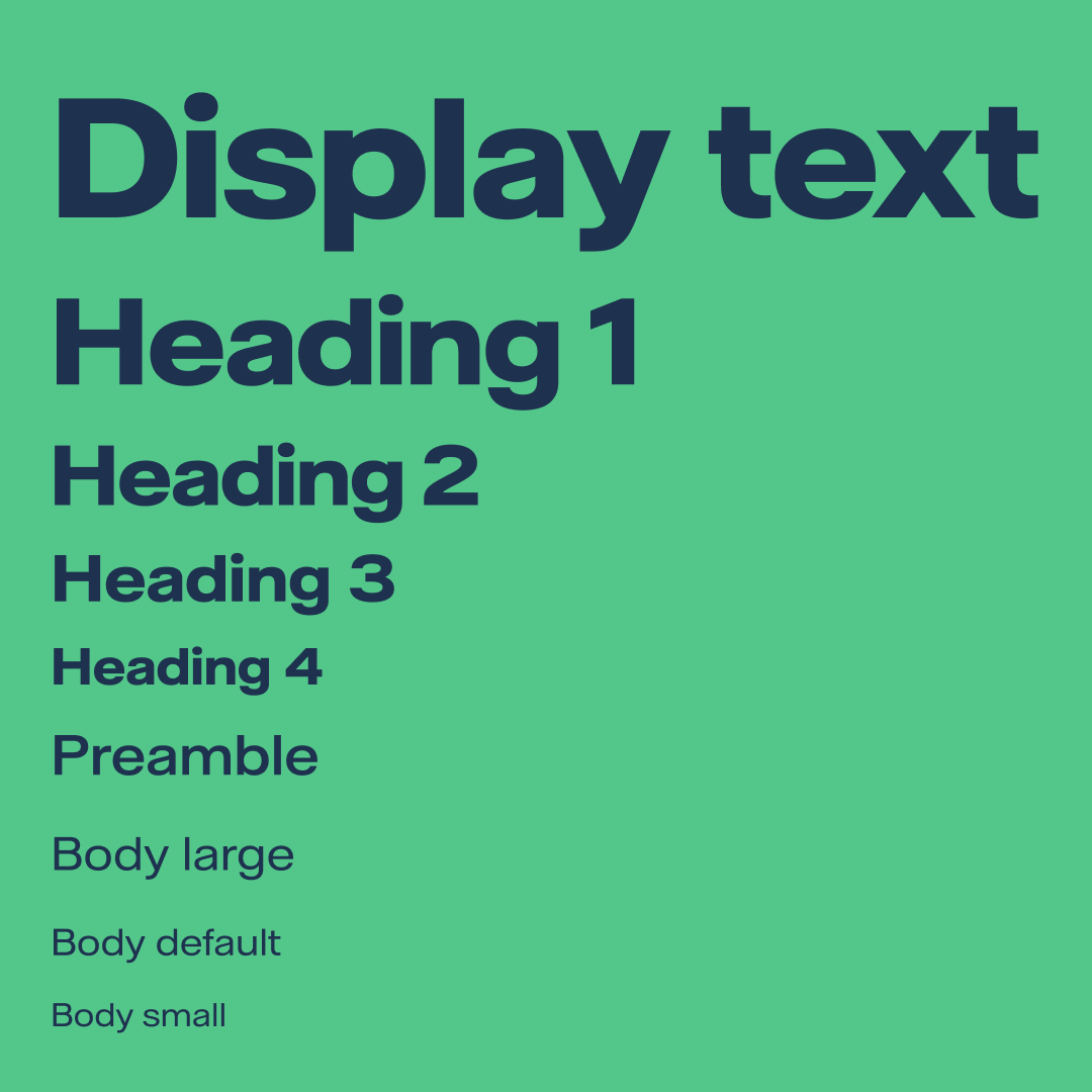
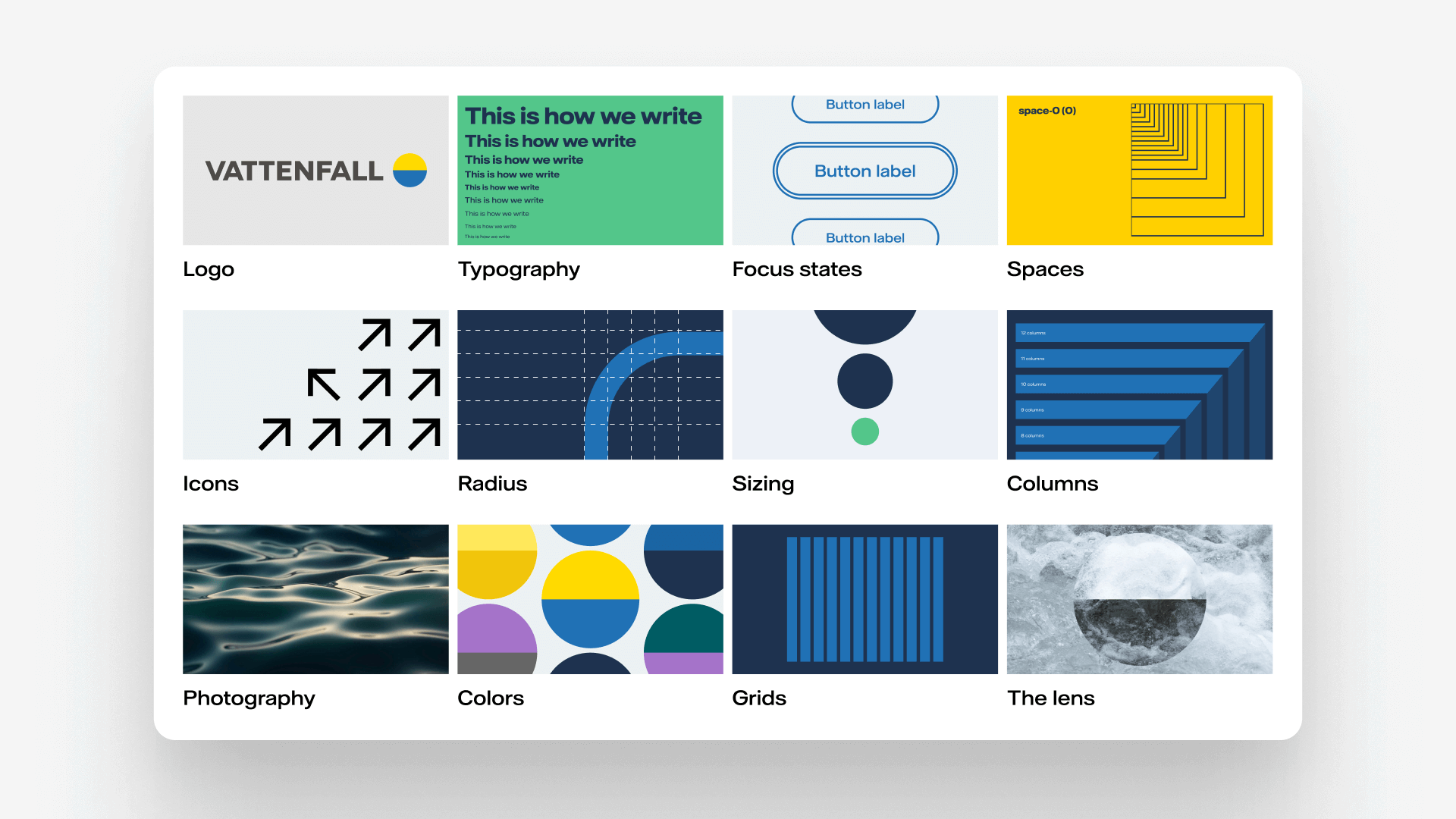
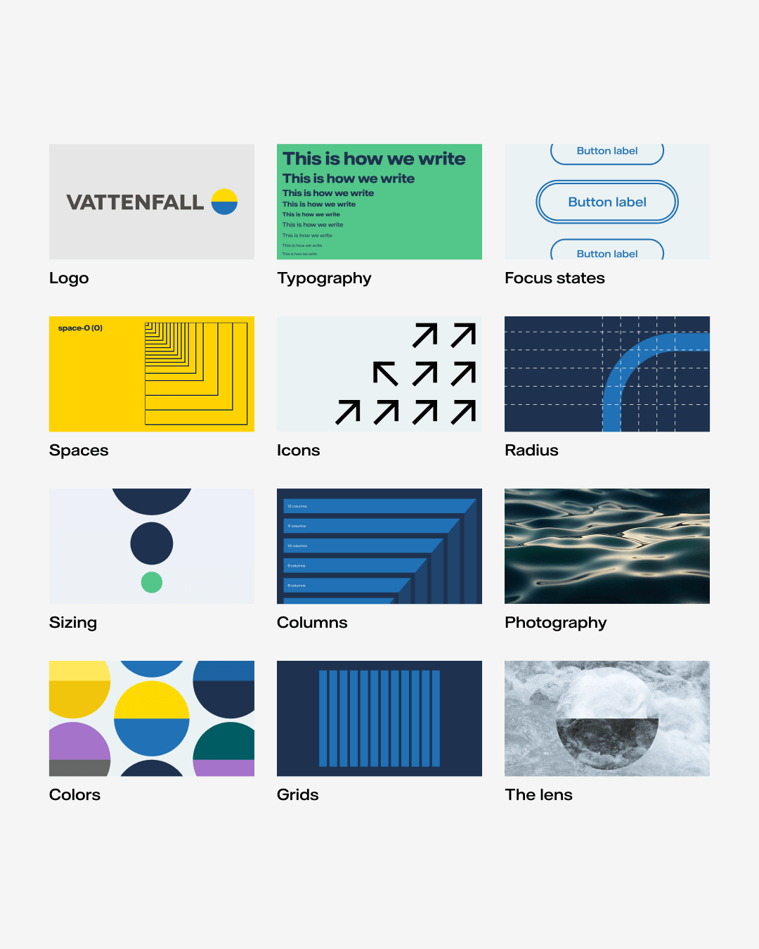
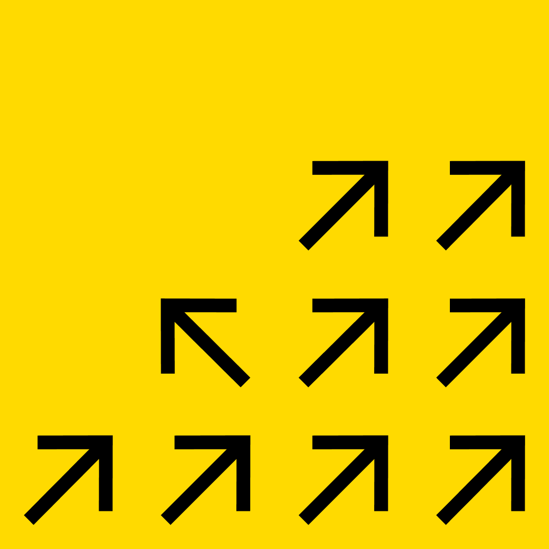
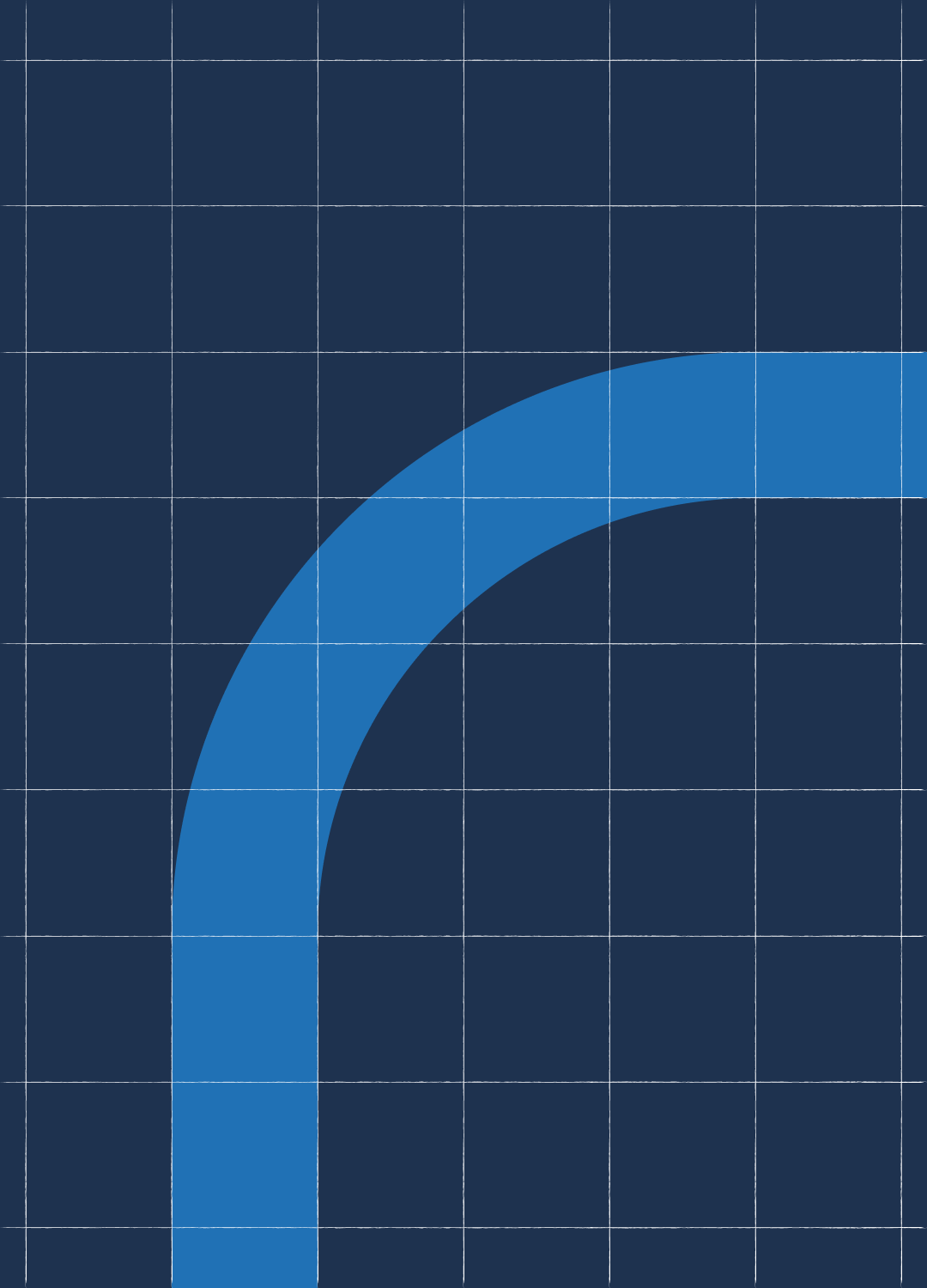
Next came the construction of foundational UI elements—what I refer to as “shared assets.” These are the atoms and molecules: small, reusable components like buttons, inputs, icons, and labels. Each of these was carefully crafted for flexibility and consistency, serving as the building blocks for more complex components.
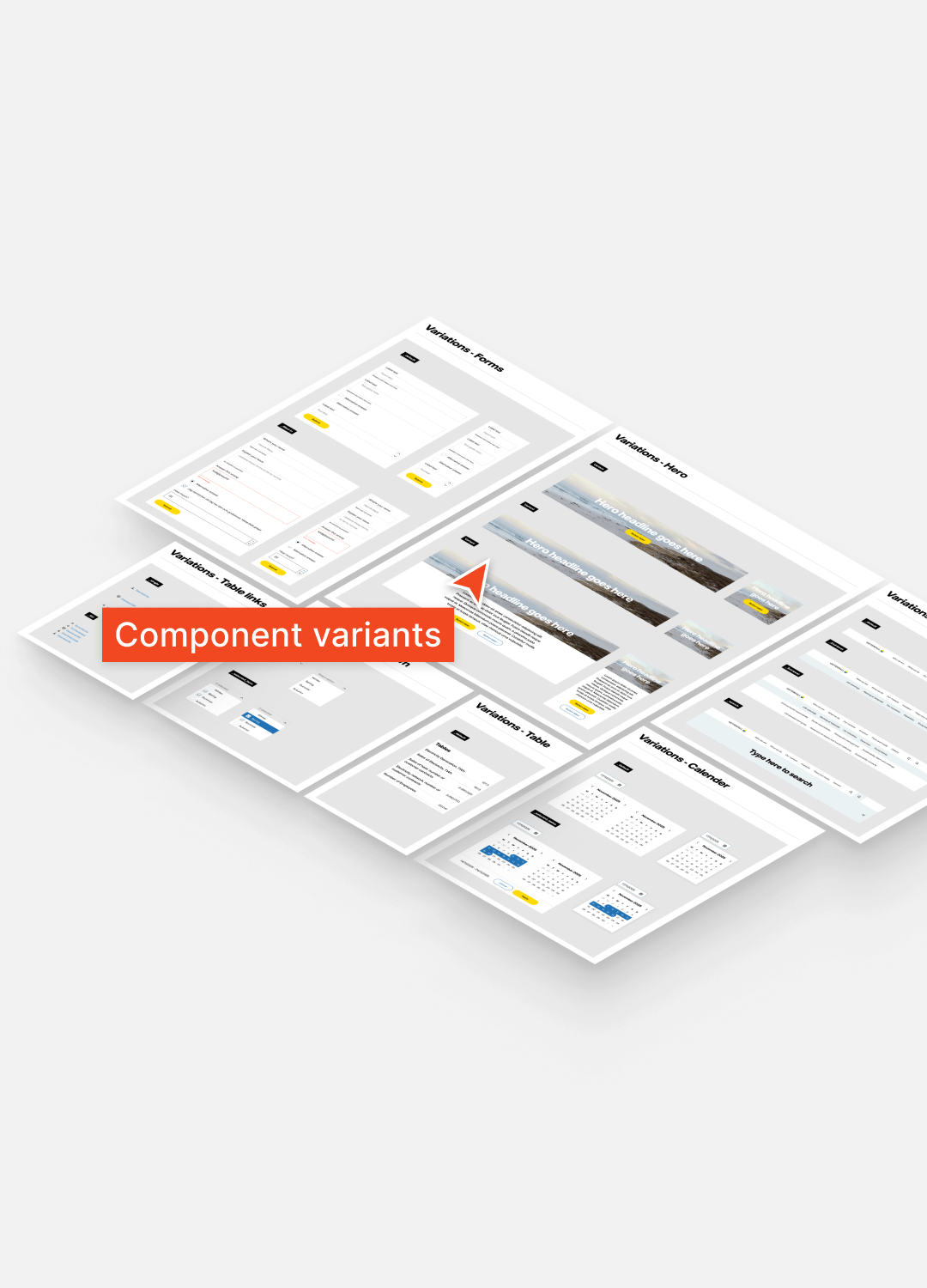
With the shared assets in place, I moved on to assembling more complex components—navigation bars, modals, tables, dropdowns and so on. Each component was built with scalability in mind, using the atoms and molecules as foundational pieces. I focused on flexibility, so these components could adapt to different content types, screen sizes, and use cases without breaking consistency.
I began with stripping away redundant components and unnecessary designs. Scoping a great set of “first delivery” components. Together with tokens. Design tokens is a wonderful method to manage design properties and values across designs using the library.
A design system of this scale ( first-delivery) is not expected to solve even half of the different teams needs within Vattenfall. But more importantly in my opinion, a design system of this scale best feature is it’s tokens. When done well, it can enable full organisations to design correctly, according to brand-guidelines, with less guesswork, removed misunderstandings between designers and developers and possibly bringing higher efficiency when building own components.
Next came the construction of foundational UI elements—what I refer to as “shared assets.” These are the atoms and molecules: small, reusable components like buttons, inputs, icons, and labels. Each of these was carefully crafted for flexibility and consistency, serving as the building blocks for more complex components.
With the shared assets in place, I moved on to assembling more complex components—navigation bars, modals, tables, dropdowns and so on. Each component was built with scalability in mind, using the atoms and molecules as foundational pieces. I focused on flexibility, so these components could adapt to different content types, screen sizes, and use cases without breaking consistency.