Werlabs
Redesigning Werlabs Website with Priority Guides
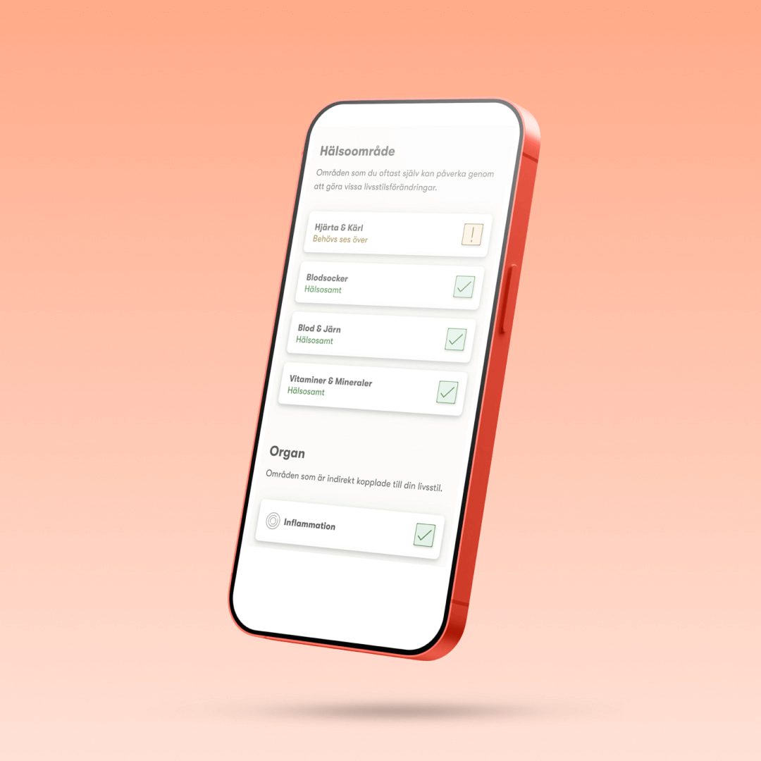
Better health for everybody
Introduction

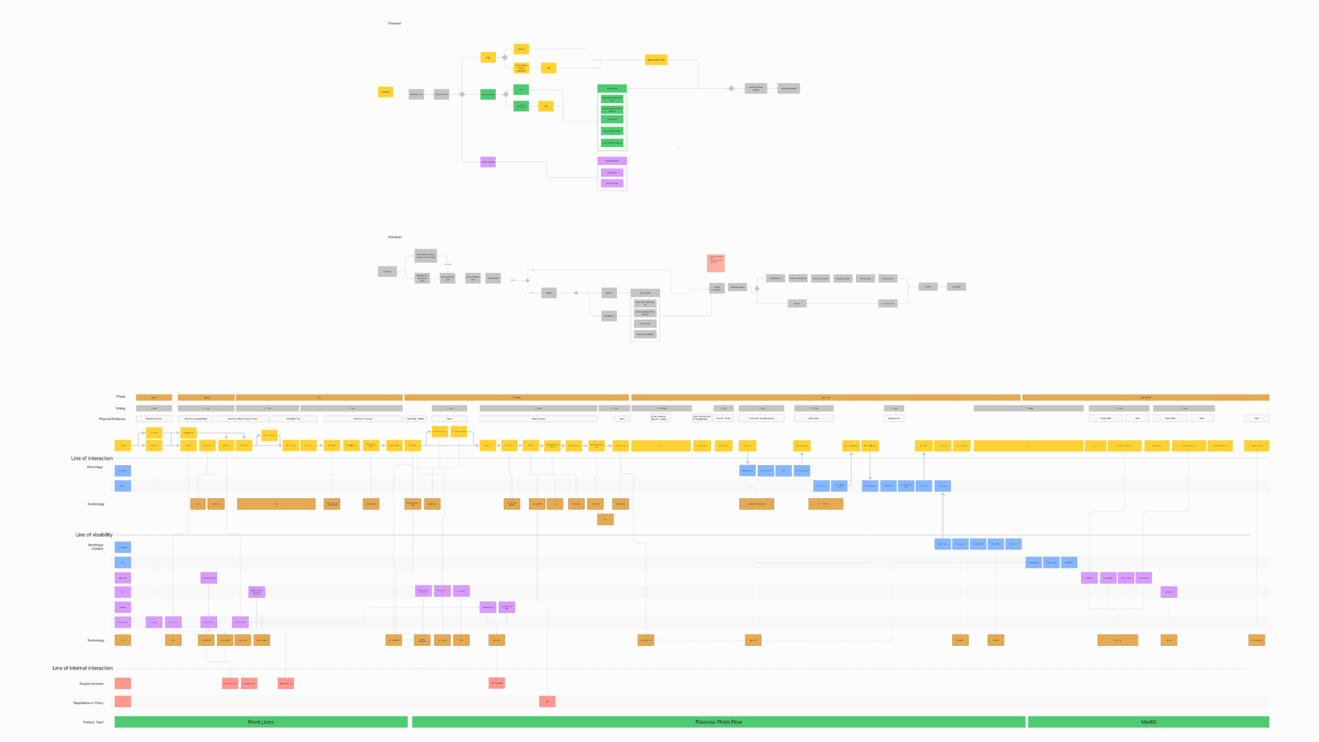
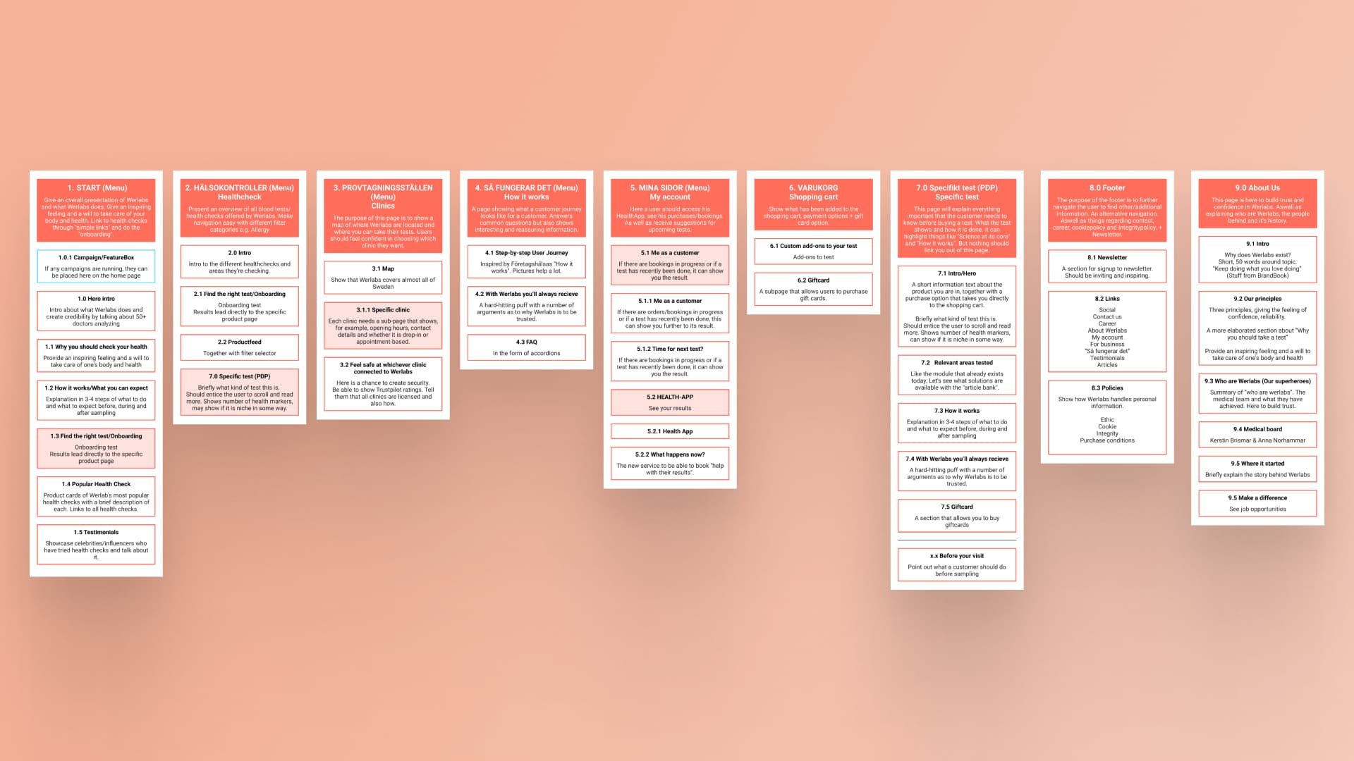
Begin with High-Level Priority Guide
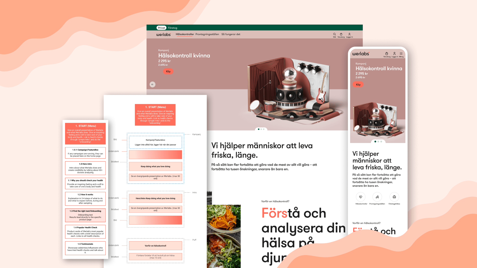
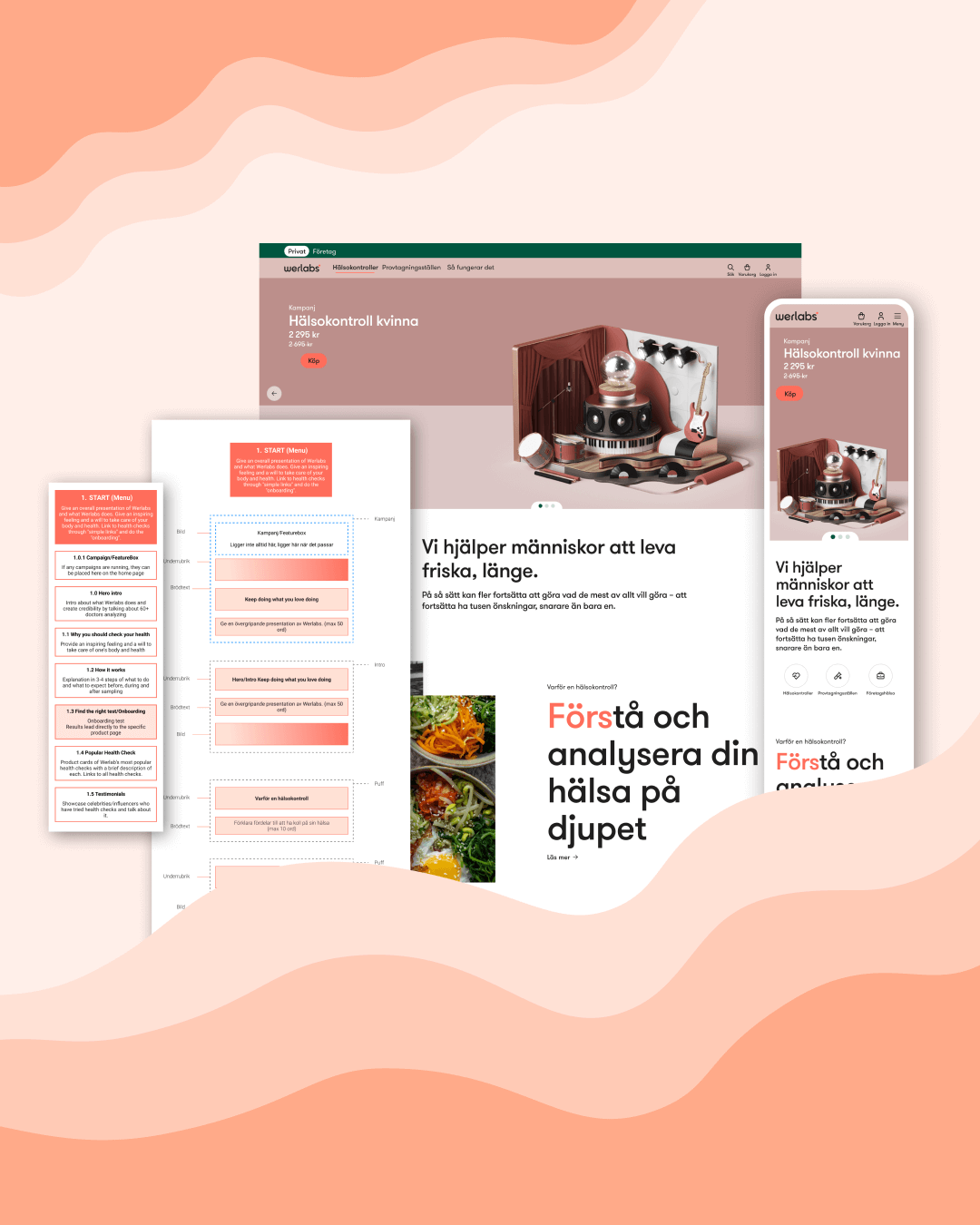
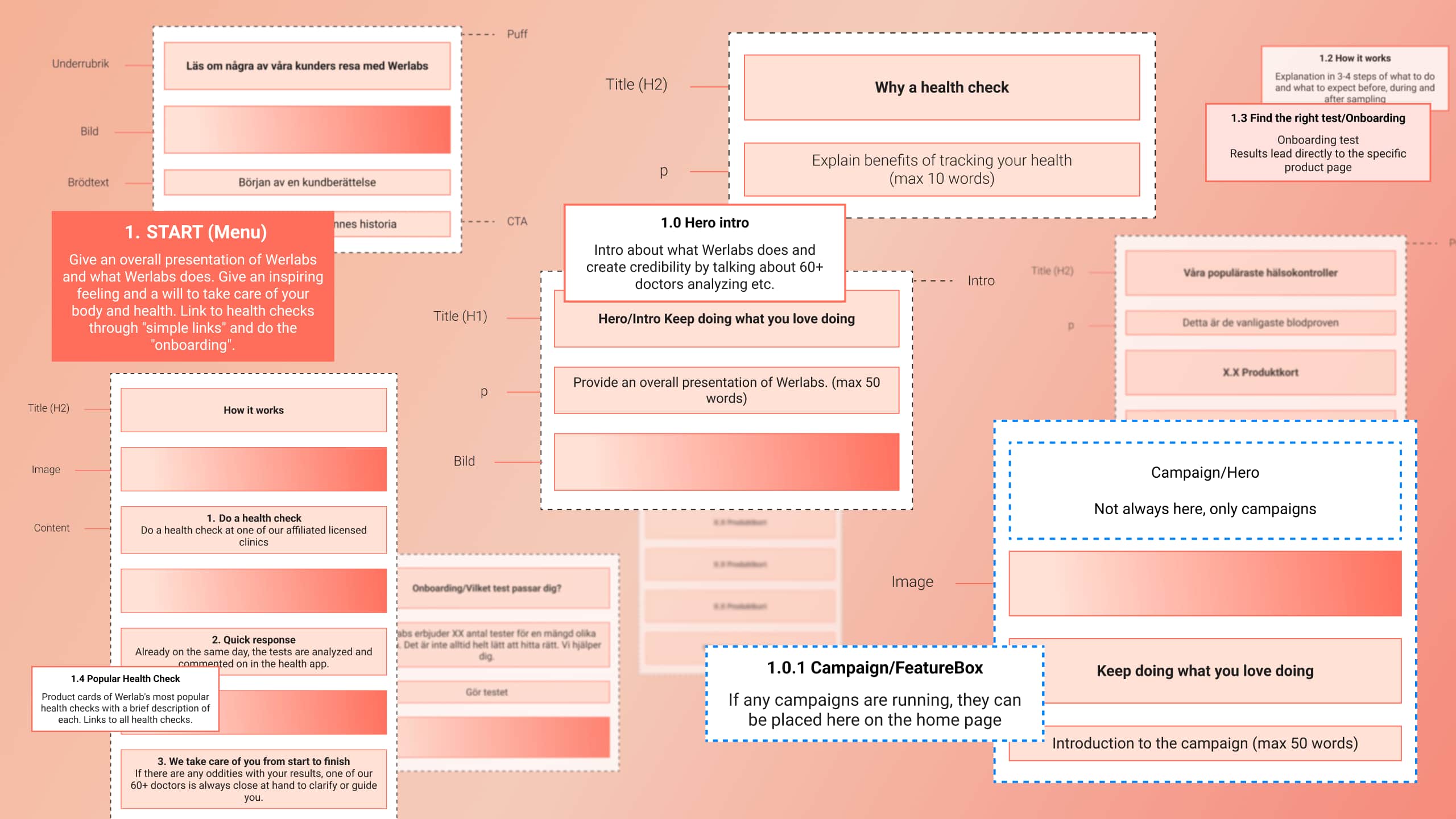
A Priority Guide is a content-first design tool used to define the information hierarchy for each screen, especially in mobile contexts. Unlike wireframes, it omits layout specifications and instead focuses on what content should be presented and in what order — based on both user needs and business goals.
“Focused on solving problems and serving needs.”
At this early stage, the guide helped frame key conversations between designers, developers, and stakeholders. It allowed us to align on priorities without being distracted by visual design.
Follow with Detailed Priority Guide
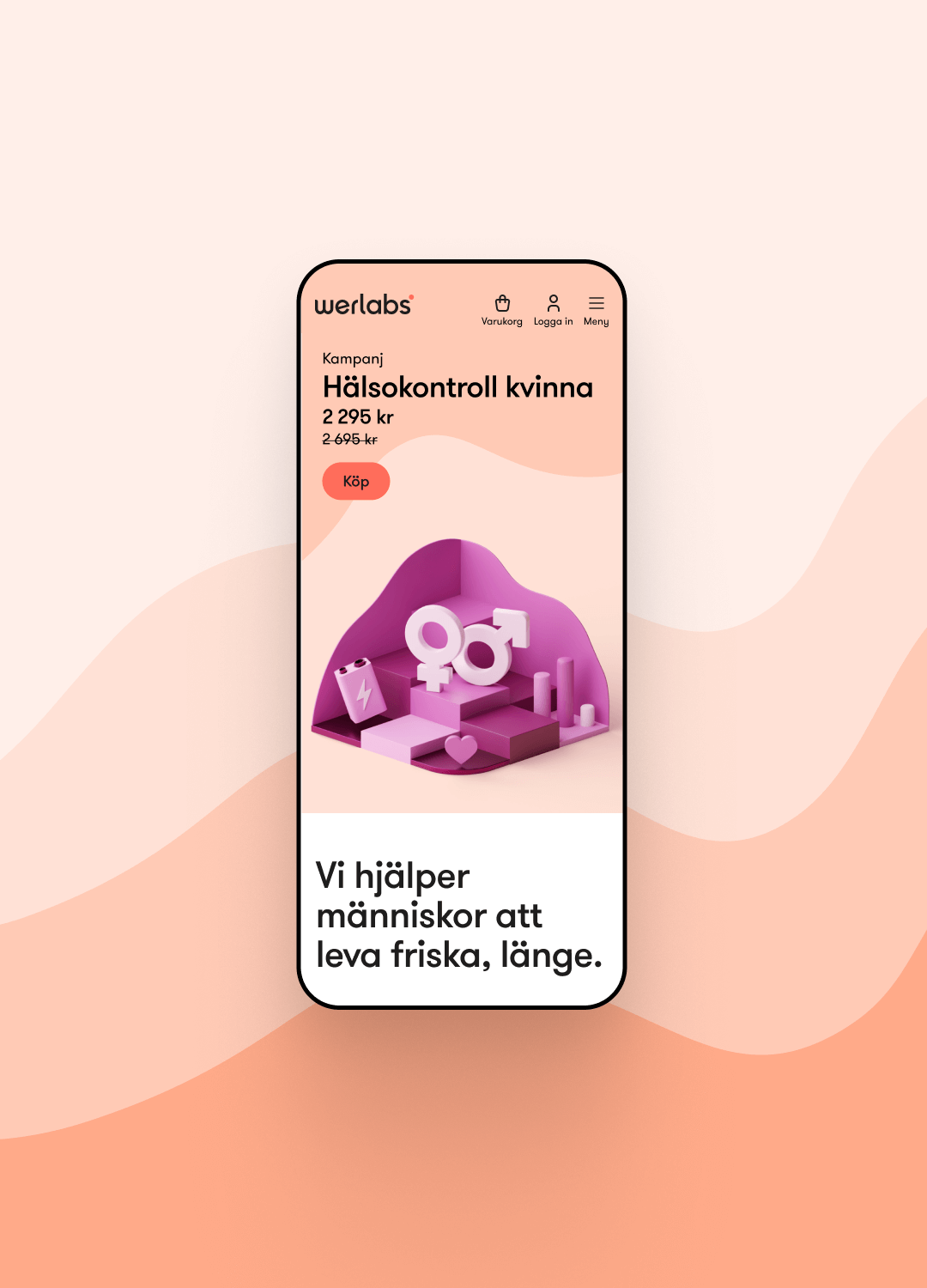
With the high-level guide was approved, we developed the Detailed Priority Guides, refining each screen with real, production-ready content. This step also included known functionalities, and proved to be a major efficiency gain: developers could begin building with actual HTML early in the process.
Content decisions were based on what actually wanted to be said, rather than visual hierarchy, which in turn made it quite easy for stakeholder to approve the content. But most importantly, developers could easily track and get usable HTML early.
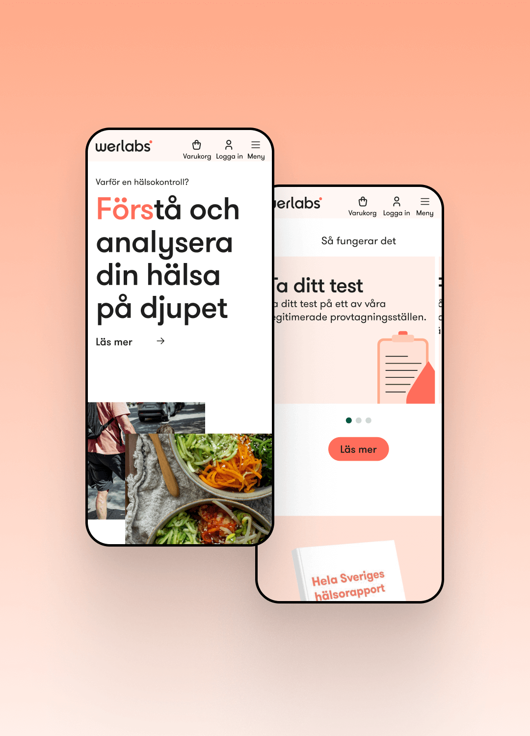

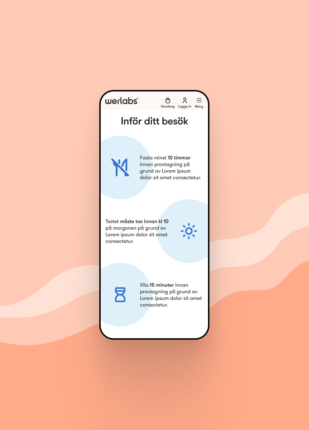
Visual design & collaboration
UI Design